Designing dashboard with custom data visualization

I believe, in an age of information explosion, a traditional way to visualize data already cannot solve the problems we face. Dashboard, as a crucial tool for almost every company to monitor business data, needs to be created in a new way.


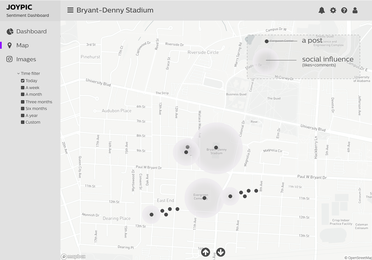
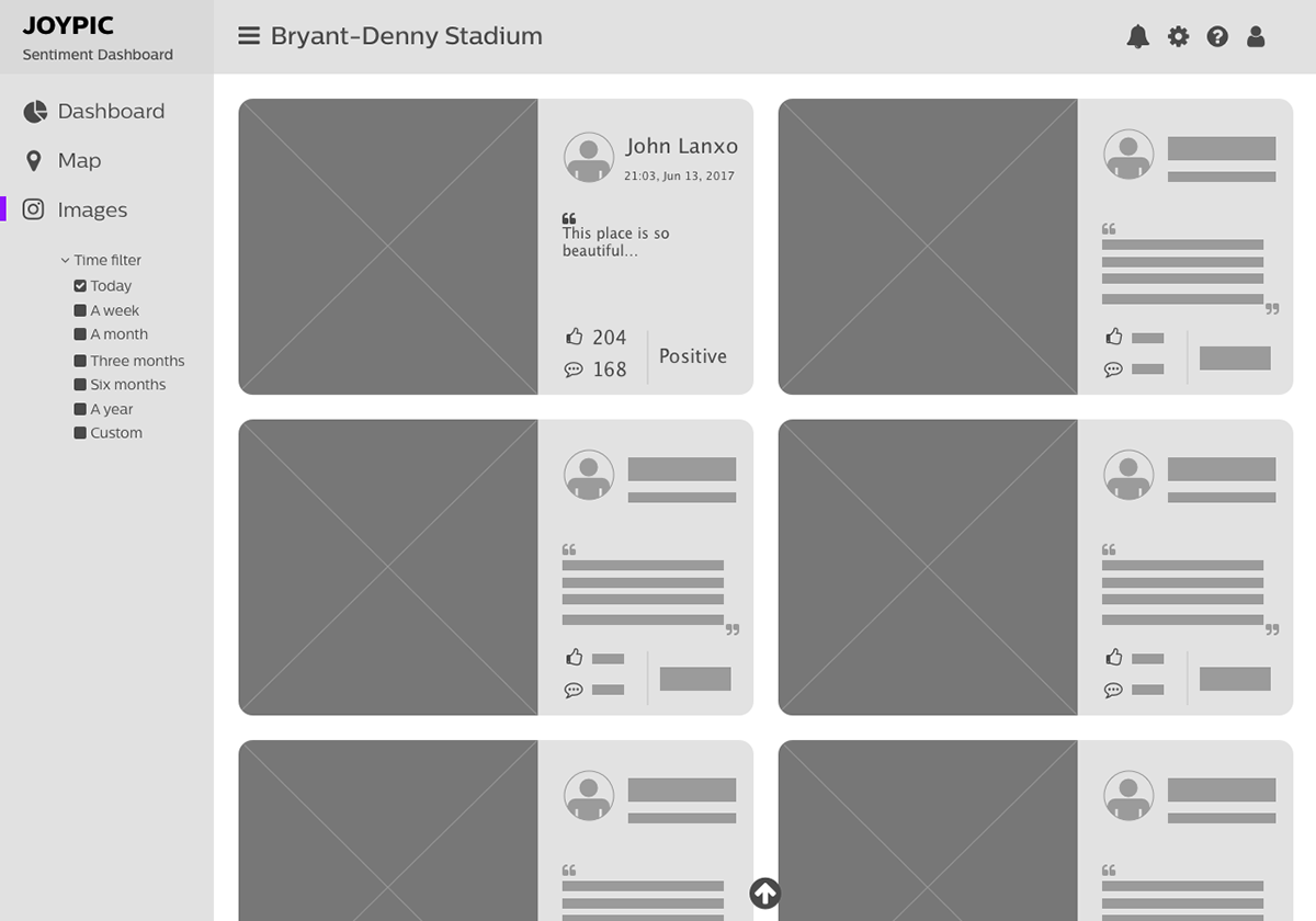
From left to right: dashboard, sentiment map, Instagram posts grids.
What is this dashboard used for?
When we talk about social media, we must think about Facebook, Twitter, Snapchat, and Instagram. However, if we want to analyze public data of social media, and focus on images, there is only one choice we can have: Instagram.
This dashboard is aiming at providing sentimental analysis of the photos taken at the top 50 places on Instagram. The dashboard provides information on how people “feel” about the places where they take photos. It shows the trend of uploads of photos, key words people discuss, and the main colors of photos uploaded to Instagram.
Design thoughts
Here are two parts to discuss how I conduct this dashboard: user interface, and data visualization.
User interface
Gradients and cards layout. Because this dashboard is using photos from Instagram and provides sentimental analysis, I want to use gradients to present the nature of colors and people’s feelings. This is inspired by Microsoft’s Fluent Design System. Cards layout is clear which helps us to navigate and makes each diagram stand out.

The fall sunset in Boston
Custom data visualization
I use three custom data visualization for this dashboard: “hourly upload distribution” , “distribution of sentiment performance”, and “image grids.”

“Hourly upload distribution” shows the daily uploads of photos in a round shape(like a clock), it will help readers to understand the data is shown in a daily format. The patterns of data will be easier to be detected in this style than in traditional bar chart style.
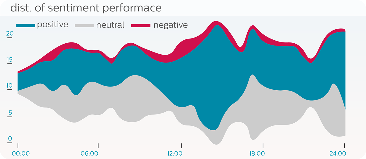
“Distribution of sentiment performance” shows how the sentiment data of photos vary in time. It provides three dimensions of sentiment helping readers to identify how the sentiments change.

“Image grids” extract the main color of each photo. Instead of using a traditional bar chart, I use image grids to present the number of photos and their main colors because when analyzing photos, colors show something we need to pay attention to.
Research process
This part includes comparative analysis, requirement analysis, and information architecture(sitemap).


Development
Sketches


Low fidelity wireframe